Making Of - Wasp
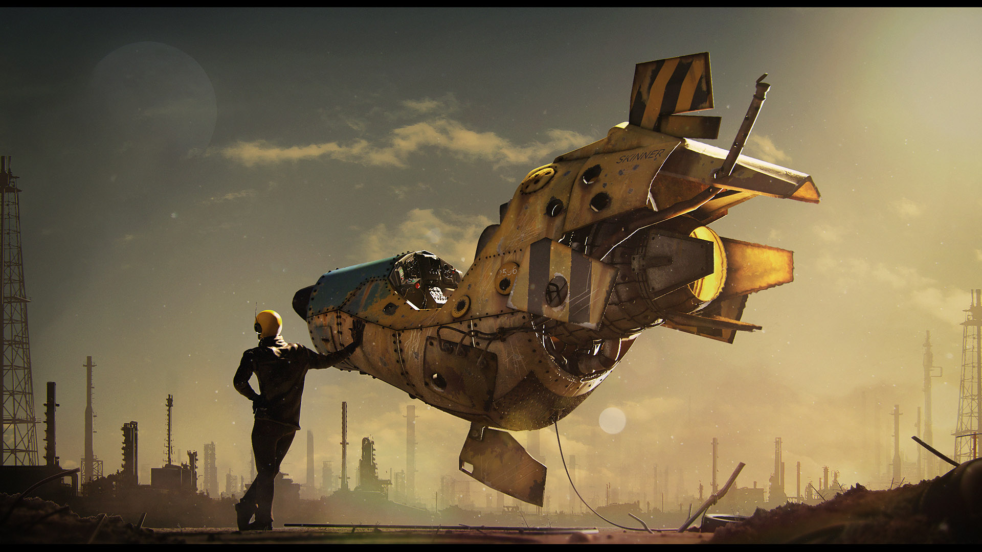
Hello! My name is Paul H. Paulino and in this making of, I would like to share the process behind my latest artwork, Wasp. I will try to explain my thought process throughout the whole project.
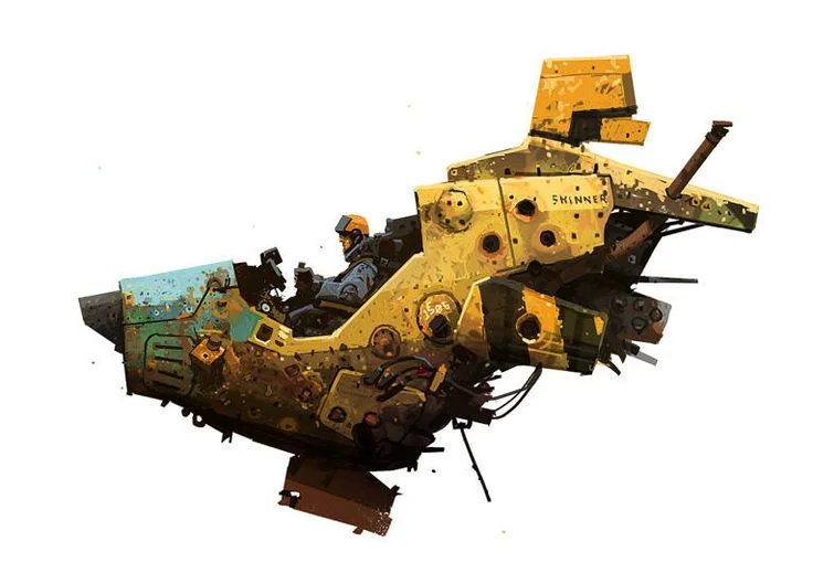
I created this piece for a class at Think Tank Training Centre. The goal of the project was to create a 3D still image in 4 weeks. I chose this amazing concept by Ian Mque.
Choosing the Concept
This is a very important part of the project! Before starting any modeling or texturing, you should think about your concept. You are going to spend a lot of time on it, so make sure to choose a concept that you really like, but also be careful; think about your skills and be honest with yourself. If you have a deadline like I did, don’t pick something incredibly hard, because you can end up frustrated and dropping the project before it’s done. Also avoid picking a concept you know will be too easy and isn't going to give you any troubles during the process. Troubleshooting is an awesome skill, and you get it with experience, so here’s your chance!
In my opinion, the best concept for you is the one that gives you the chance to learn new things and you can still finish on time.
I’ve chosen Ian Mcque’s concept for three reasons:
1 - Improve my Hard Surface Skills
Since I wasn’t feeling confident about my modeling skills, I thought that this was a good chance to explore different workflows and overcome my weakness.
2 - Interesting textures
Ian Mcque is well known as an amazing concept artist and the thing that catches my eye the most in his work is his unique painting style. Trying to replicate the same feeling in 3D was a great challenge for me.
3 - Opportunity to create a story without limitations
Since the artwork itself doesn’t have a background, it was interesting to think about a story and composition for the scene, and for me, a piece that tells a story is way more interesting than one that doesn't.
Getting Feedback
During the project, show it to friends that you trust to get good feedback. But be careful; always remember your original idea and don't listen blindly to the critique. Always take it into consideration, but remember that it’s your project and if you change after every criticism, you’ll end up making a frankenstein.
Pre-Production
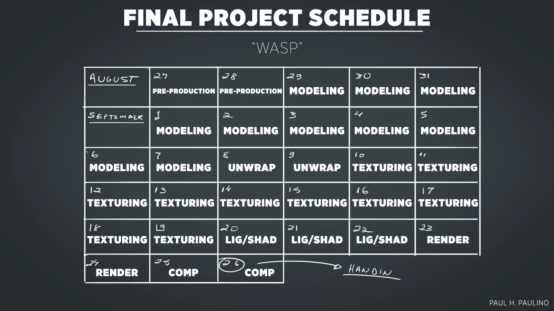
Another important thing that I always like to do and helped me during the whole project was creating a schedule. I made a personal schedule based on the deadline given by my teacher.
Having a deadline for each part of the process increased the pressure, but helped me a lot with the feeling of working in a professional environment.
Sketching Composition Roughs
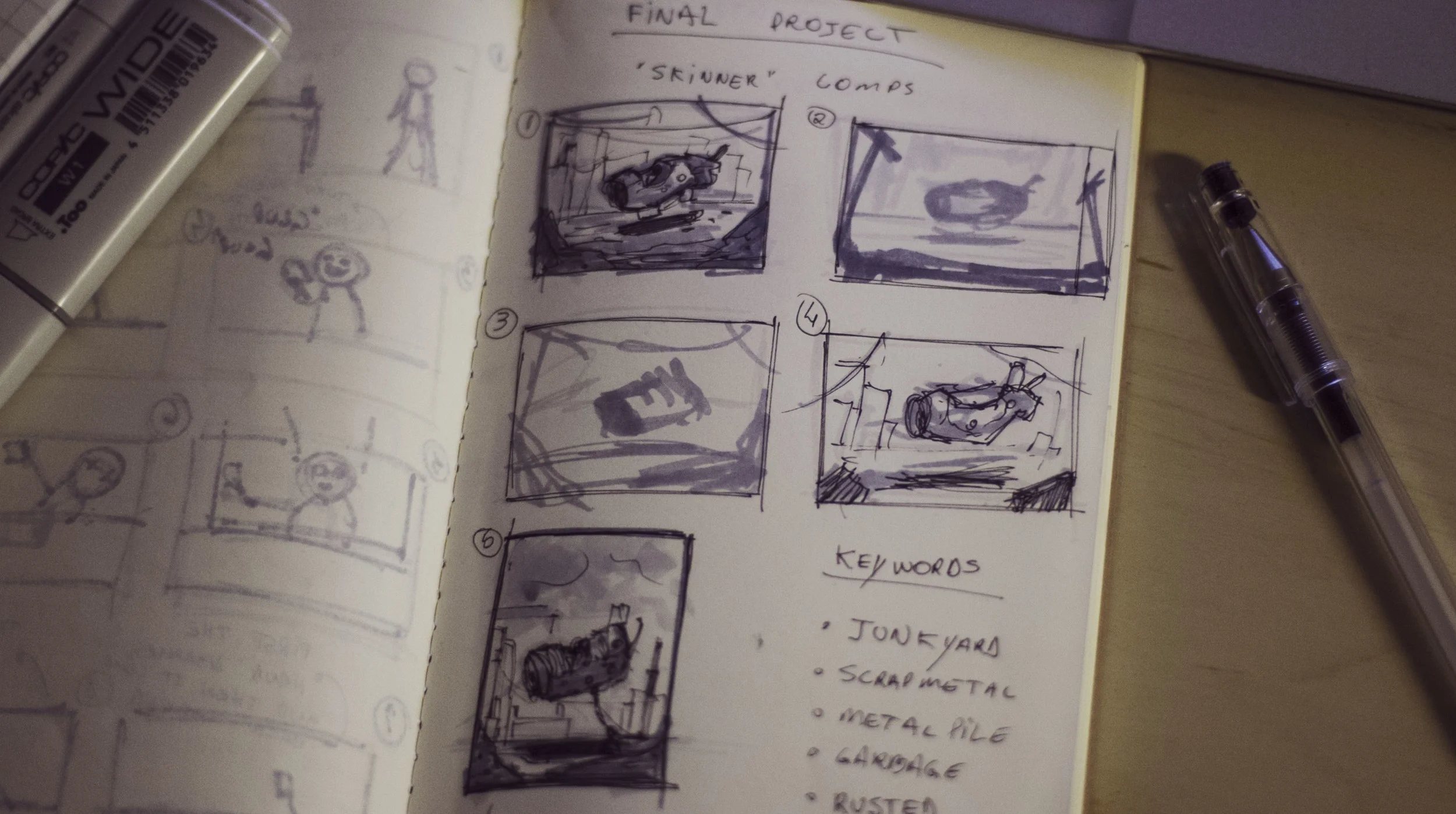
During the days for pre production, I began to think about the composition. For me, the best way to develop different ideas is using quick sketches with pen and paper.
I love sketches: they are loose, fast and you don’t need to worry about details at all. On the sketches below, I used copic markers to give some depth with values. You can quickly change what you don’t like by just adding lines and brush strokes. My final composition is different from my first rough sketches, but these first drawings helped me a lot!
The first idea was having the ship floating in a scrap yard, the pilot inside and looking at the camera. For the background I thought about some industrial buildings, cranes, etc. As you can see, in the beginning, I was worrying so much about the composition itself, that I ended up missing the story.
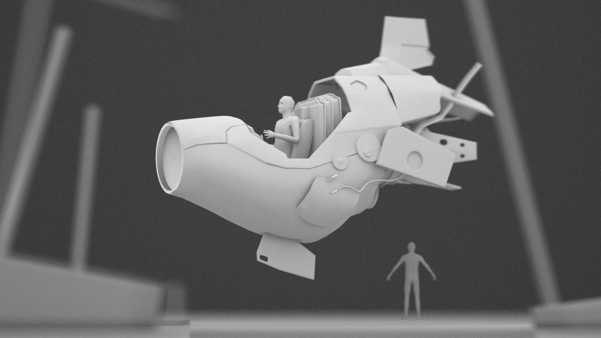
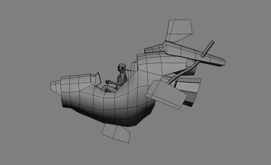
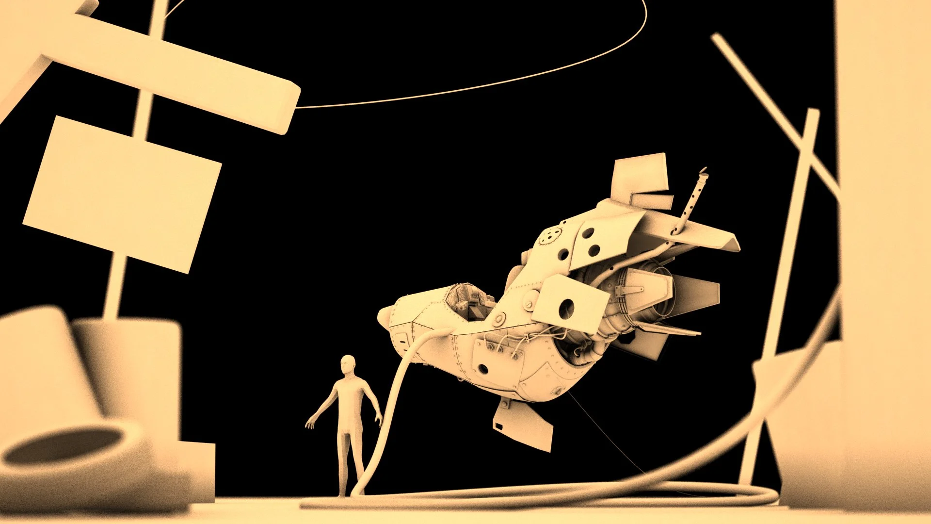
After my initial sketches, I decided to go into Maya and block out some shapes to try and match the composition.
It’s a good way to quickly see if your composition is balanced without dealing with details. I just used simples boxes and cylinders. For the characters I used a default human base mesh from Mudbox as a scale reference.
Understanding the Concept and Gathering References
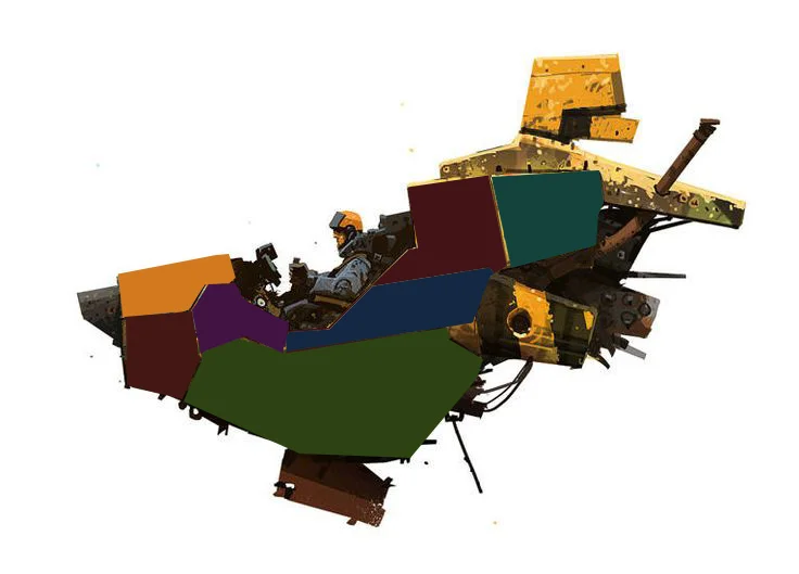
After the initial composition studies, I spent some more time investigating the concept, breaking down the basic shapes and proportions, drawing orthographic, isolating each part of the ship and thinking about the individual panels.
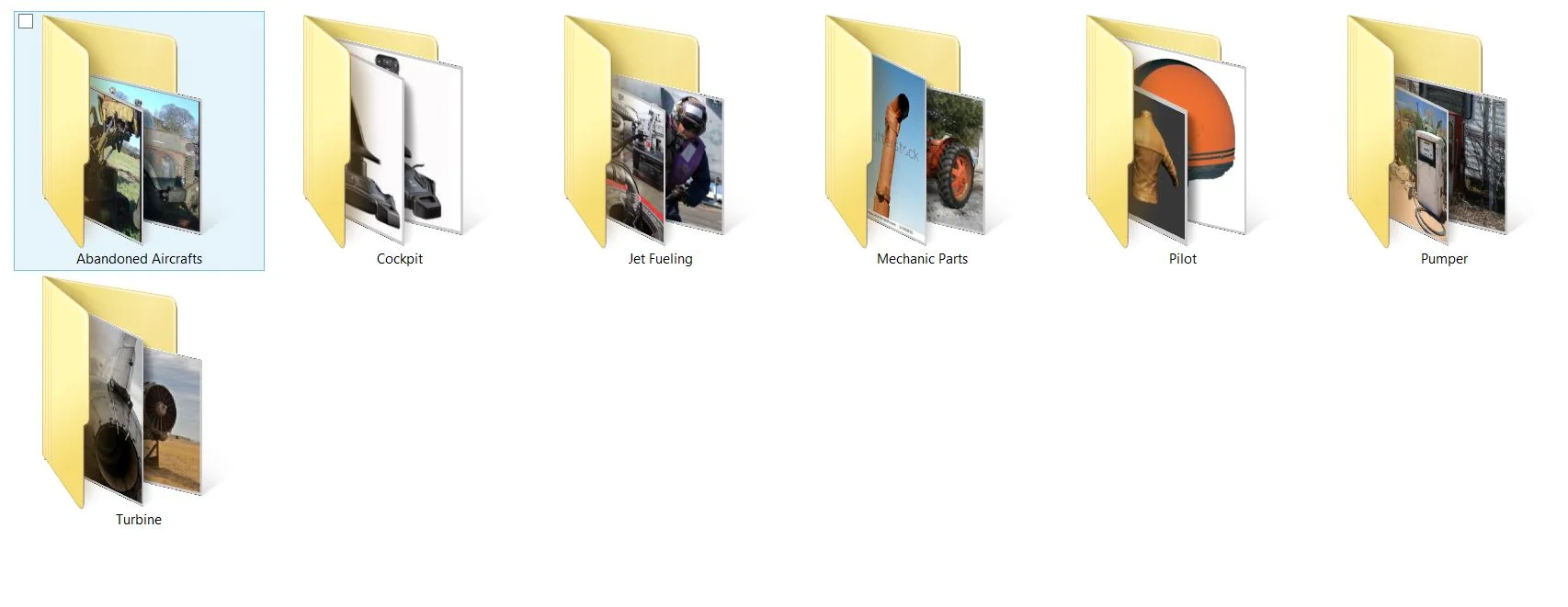
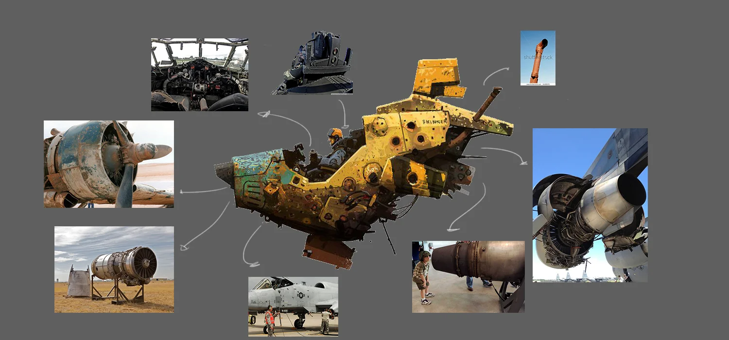
My goal with the project was to achieve a scene close to reality and the best way to do it is gathering real life references. I love to spend time searching for references and they are essential for a believable result.
Even if you are trying to create a “unique” design, you should rely on things that already exist in our world, otherwise people are not going to understand and relate to the design. That being said, it doesn't mean your piece isn’t going to be creative. Quite the opposite: your piece can be even more original if you use our real life resources with creativity.
When looking for references, I usually go for interesting and high resolution photos. Google Images and Flickr are simple enough for this. Flickr is an amazing tool if you are looking for artistic photographs (which can be useful when thinking about composition too).
Besides real life photos, try to get drawings, replicas and 3D renders that inspire you and relate to your piece. Collect references not just for modeling purposes, also think about lighting, color, etc.
One thing I to do (and may sound crazy) is constantly inspect the world around me. When I’m on the street, I like to see and understand how real materials look and work, so I often use my smartphone camera to take pictures. Being able to study these materials helps me a lot when I’m trying to replicate them later.
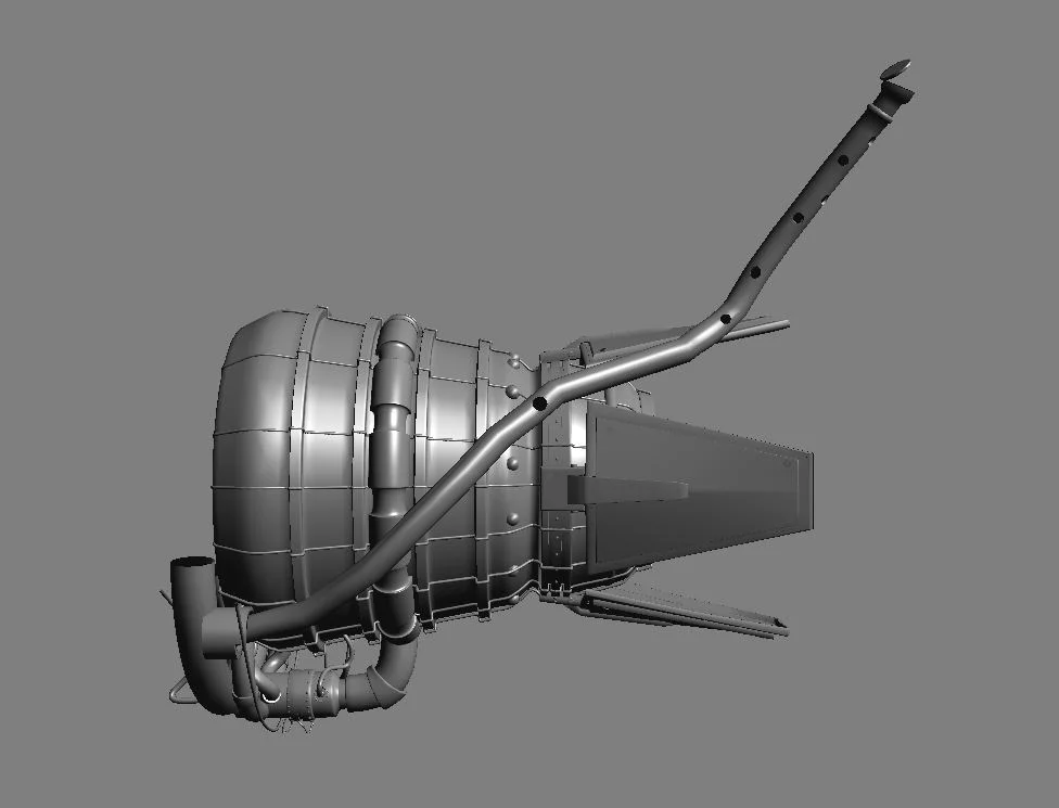
Since the concept didn’t have a detailed turbine, it was very important to grab and study a lot of different photos from jet turbines and space shuttles to fill this gap in my project.
Modeling (XSI Softimage)
The whole modeling of the hovercraft was done using Softimage. It’s a powerful tool for modeling, and in my opinion, way more intuitive and straightforward than Maya.
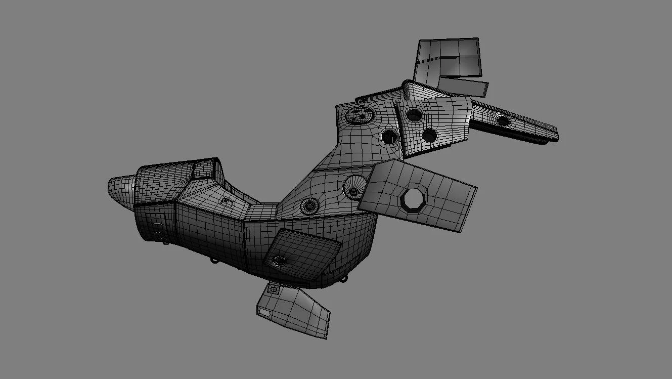
I started modeling the hull with a cylinder, without extracting any panels at first. The main goal at the beginning was to capture the shape of the hovercraft, trying to keep it as close as I could to the concept. I created some simple shapes for the engine and the cockpit. This way I was able to study the negative space of the hovercraft without having to deal with lots of detail.
Blocking your model with simple shapes gives you the chance to change things inside your composition without wasting time fixing small stuff and dealing with details.
I also used the basic rig that Softimage provides, to place a human inside the hovercraft to help me figure out the model’s scale.
Once I was happy with the hovercraft’s basic shape, I decided to start subdividing the hull.This way I was able to create holes and, at the same time, avoid bumps and creases on the geometry.
After this, I began separating the panels. It was a tricky part because the concept doesn’t give the exact seams on the hovercraft, so I decided to make my own choice for the design. After dealing with the main part of the ship, I started detailing the turbine. This part was really fun because I had freedom to create my own design. I asked a classmate who knows a lot about jet engines to give me a lesson about it. After some time, I generally understood how turbines work, and then I used my references to finish the model.
The cockpit was another part of the hovercraft which I had a lot of freedom to develop, so I used my references to create a bunch of panels, buttons and cables.
UV Mapping (Maya)
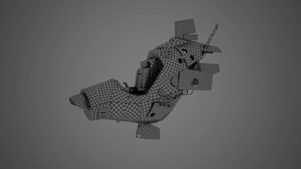
The UV Mapping process was done in Maya. Maya 2015 has new features and the integration with Unfold3D is amazing and helped me a lot during my UV process. I planned to use Mari for the texturing, so I realized that I should use multi-tile textures. This way I was going to be able to import the whole ship into Mari and paint directly on the model. If you have all the tiles on the same space, you are not going to be able to texture properly.
The UV process can be very repetitive and boring, but it's crucial to be careful with this part, otherwise you can have problems in the future.
Texturing (Mari)
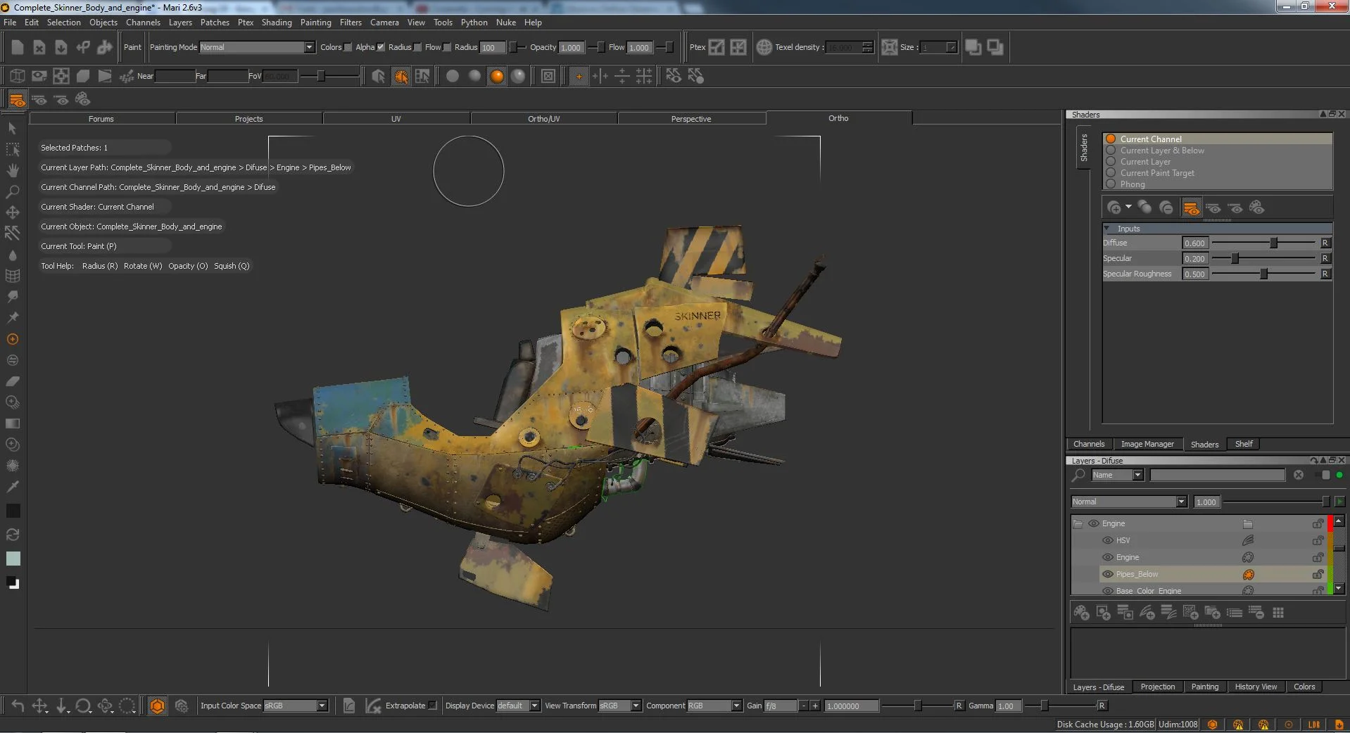
The texturing process was really fun! I chose Mari because in my opinion it’s the best texturing software today and it has a variety of adjustments, just like, or even better than, Photoshop. And being able to import the whole model is more intuitive to work.
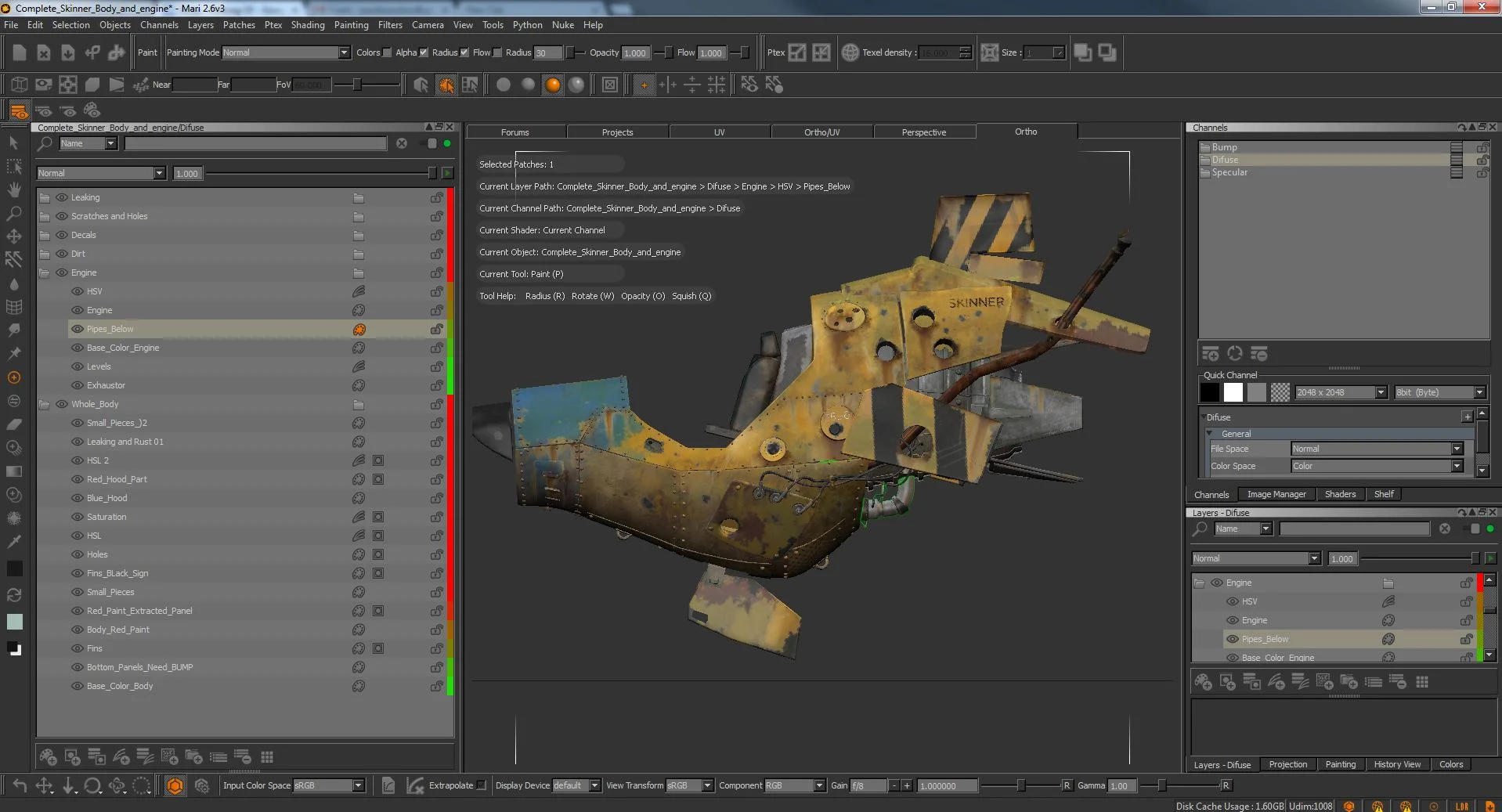
I usually like to work non destructively, so I used layers for each step and as I said before, Mari has great adjustment tools, and I try to use them a lot.
Because I had to separate the UV Tiles, I could easily select each patch and hide or unhide whenever I wanted. This is a great resource inside Mari and sped up my texturing workflow a lot. Using folders and layers, I put the hull and the turbine/engine into separated folders, this way I was able to easily adjust my textures later. Keeping the project and layers organized helps a lot. Never forget to name layers and objects as much as possible, otherwise you will waste a lot of time later on.
I created three different maps for my hovercraft. Diffuse, Specular and Bump Map.
The hull texturing process began by using some yellow metal tileable texture, which I got from Cgtextures. After the first pass, I created more color variation by mixing some different colored metal textures.
The engine was basically the same process, using tileable metal textures with different color hues and saturation to create interesting color variation. After finishing the color pass, I created more passes. Dirt, decals, leaking and scratches and holes. Those passes were extremely important to convey the realistic feel for a junky hovercraft.
I learned during this phase that you should be careful while “decaying” your model. Sometimes you can end up going too far and creating something that is not realistic or pleasing to the eye. Even in those situations, less is more.
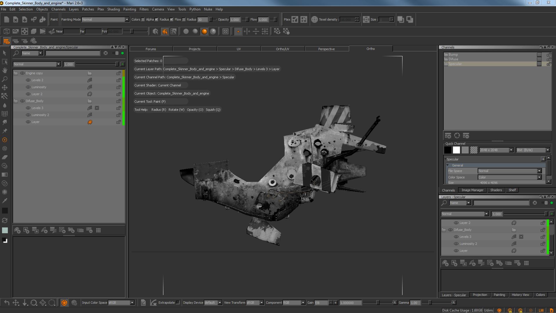
After finishing the diffuse map, I duplicated the channel and flattened all the layers to begin working on the specular map. I created a luminosity layer on top to get rid of the colors and levels adjustment helped creating a nice value variation.
Notice that I separated the engine from the hull layer, so this way I was able to create different values for them. The engine metal has a different specularity, and having this different adjustment is crucial.
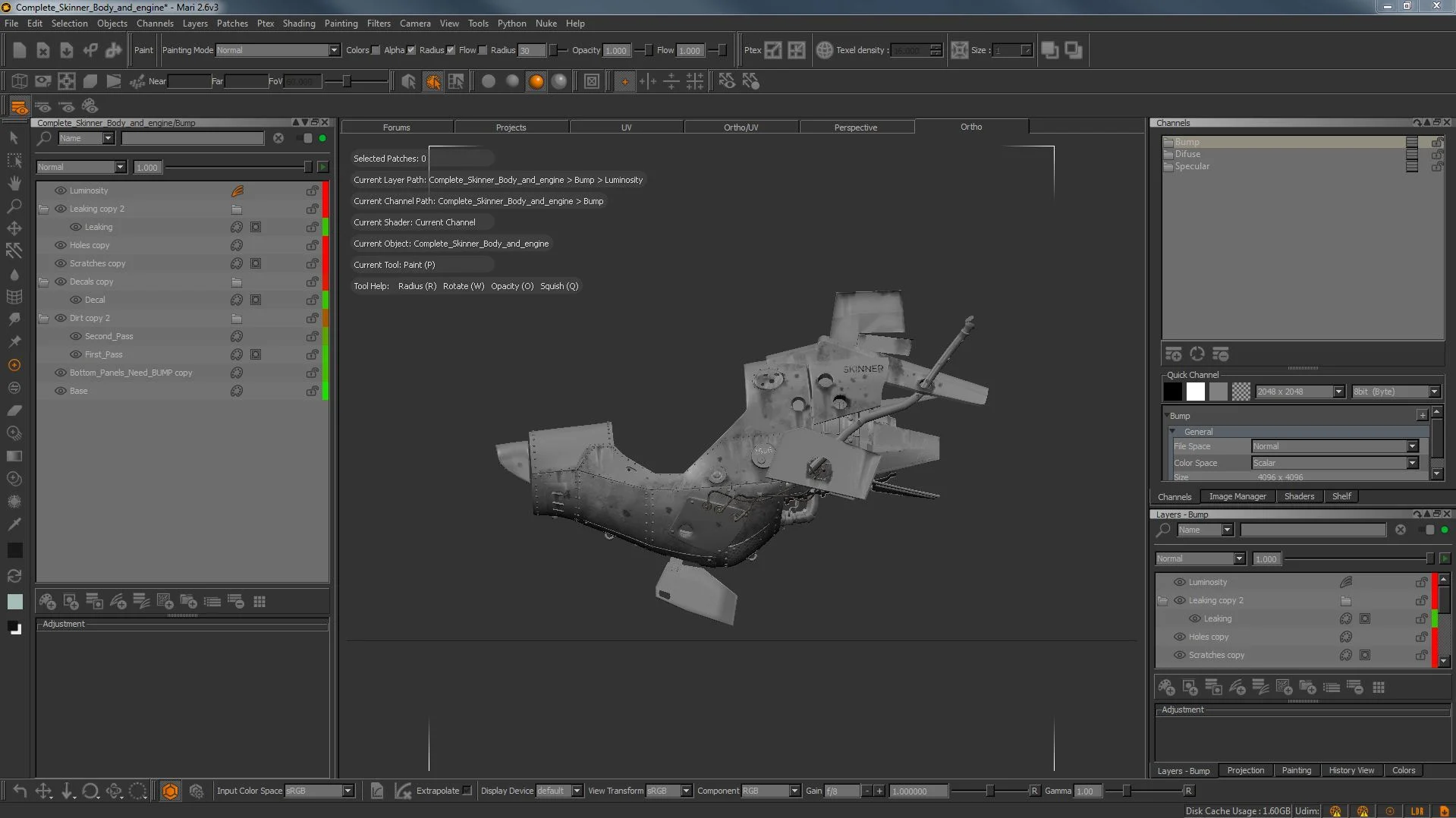
The bump map was used for some parts of the texture, like some rusted parts and especially for the extracted panel on the bottom. I used the same principle as the specular map, but with less value variation. The darker values were those which receive the higher bump information.
Final Composition/Storytelling Thoughts
Before getting into the lighting/shading part of this making of, I would like to show some storytelling decisions that I made during the project. Composition and storytelling are incredibly difficult to explain, maybe because everybody has their own opinion of what is a good composition and what is not, but we can learn some basic concepts to start developing our eye. Again, photography for me is one of the best tools to begin.
Since I can’t explain it very well, I would like to share with you some composition resources that I use constantly:
The secret of composition by Lulie
Perspective + Composition by Fox-Orion
Landscape composition rules by Johannes-Vloothuis
Framed Ink (Book) by Marcos Mateu-Mestre
And of course, you can always analyze some paintings by the old masters and try to understand how they compose images. I often use this website to access those paintings. I wasn’t happy with the idea of having the pilot inside the hovercraft, so I sketched again more thumbnails and had some brainstorm sessions with some friends.
First I had this idea with the pilot outside the ship fueling it.
It was an interesting story to explore, but I thought about my deadline and I figured out that I would have to spend hours modeling/texturing/shading different assets that weren’t my focus.
This is something really important that I learned during this project: Let it go.
Just like the Frozen song, I had to let it go some crazy and complicated ideas and think about my deadline. Nobody cares if you finish a masterpiece but didn’t deliver it on time.
So after letting go the fueling idea I started to work on a new story which would allow me to create something interesting but also “simple” enough to finish on time. After a while I thought about a relationship between a man and his machine, something like Han Solo and Millennium Falcon or even a guy and his car that he loves.
Using this idea I began to block the scene inside Maya, thinking about elements on the scene to help the composition, and I also started to develop a pose for the pilot.
The Pilot (Maya, Softimage and Mudbox)
For this new composition the pilot’s pose was extremely important, since this was going to be the focal point of the scene. To help me with that, I asked my animation teachers at Think Tank to give me advice! Who better to ask what makes good pose, huh?
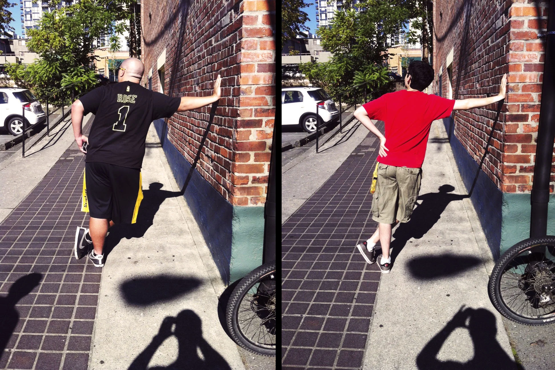
So after their amazing support, I used my camera to take some reference pictures with my friends for the pilot’s pose. It was extremely useful and helped me to get weight and balance out of the rig.
To pose the character properly, I used an amazing digi-double rig created by our rigging teacher, Darren Rudy and it allowed me achieve a natural pose for the pilot.
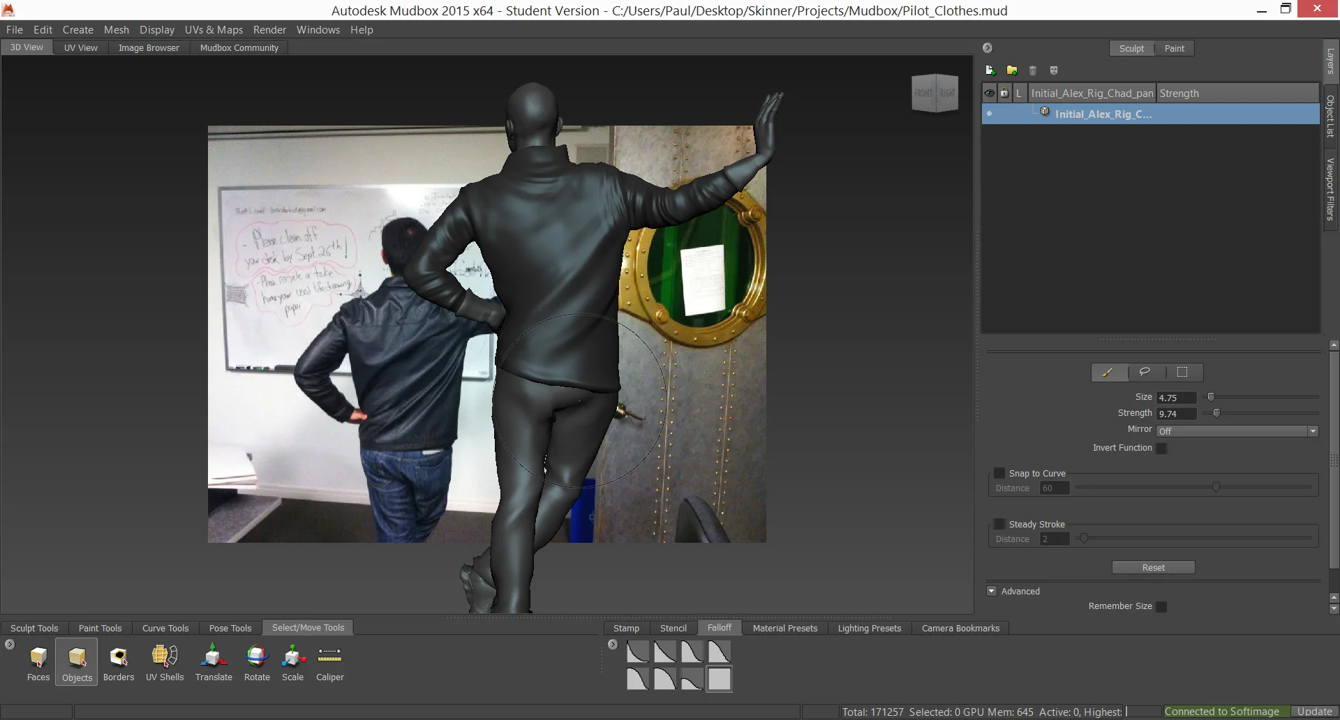
After posing the character properly, I started to think about clothing. Thinking about my storyline, I envisioned him using a leather jacket, gloves and a helmet. I brought the model to Mudbox and I used my jacket as a reference (matching the pose) to sculpt the folds.
Back in Softimage, I extracted the head geometry to create a simple helmet. I did the same thing for the gloves and boots. After finishing the pilot, I imported the geometry into Maya.
Environment (Maya and 3ds Max)
With the pilot finally done I had to think about an interesting environment for the hovercraft. I didn't want to spend a lot of time on it since I was running out of time with my schedule, but I still wanted to make something which would allow framing the image and enhance the composition.
So keeping it simple, I created some piles of mud using displacements maps on the foreground, creating a frame for the shot, and inside the piles I used some simple materials to give a industrial/construction site feeling to the environment.
I also included some tires that I modeled, and with the help of my friends which are more familiar with 3ds Max, I created some rocks and bushes for the ground.
Shading (Maya)
After finishing the texturing process, I imported all the maps to Maya. The shading network can end up pretty complex, so be careful with the scene’s organization. Sometimes one little mistake can compromise everything.
Lighting (Maya)
Lighting plays an important role in a scene and it can help a lot telling a story. I've always been passionate about lighting, so with this piece I had the chance to practice. Thinking about the storyline that I chose for my scene, I thought about a lighting setup which would allow me to create an interesting contrast between light and dark. To help me with this, I used some photo references (again!) to understand how light works on the real world.
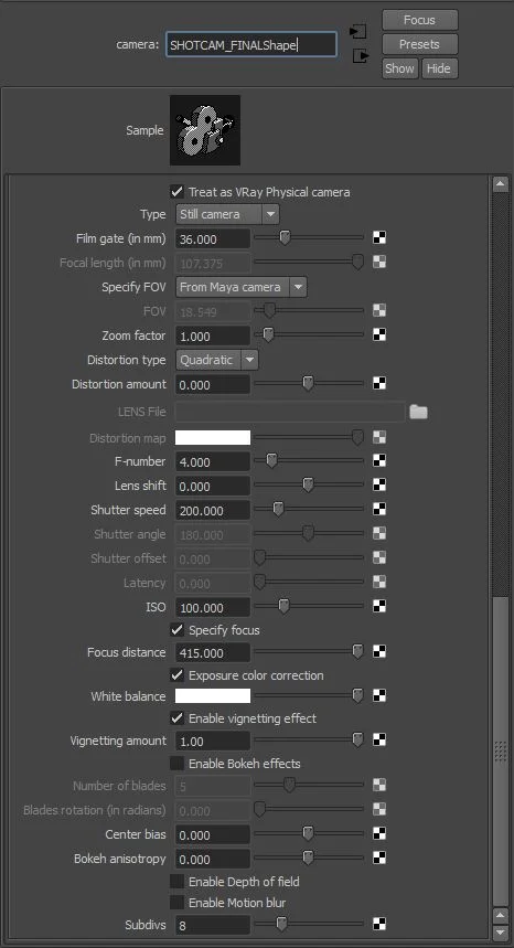
Using Vray as my render engine, I set up a physical camera to achieve more realistic results.
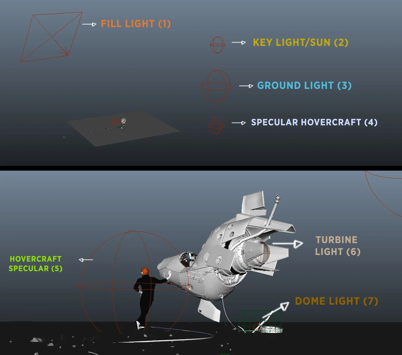
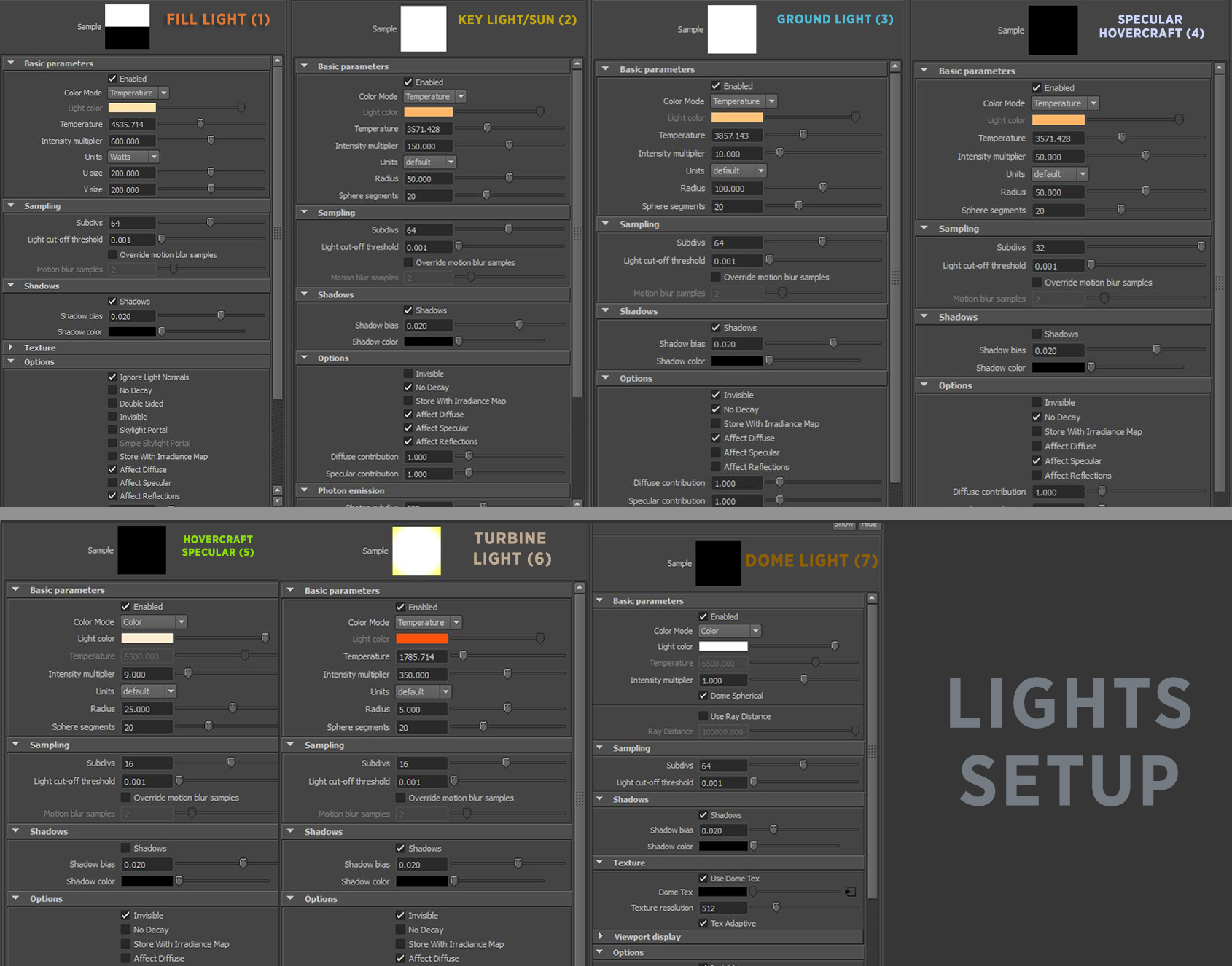
The light setup was pretty straightforward. I used a Vray sphere lights without decay as a sunlight, a dome light with a HDR map and a few bounce/specular lights.
Rendering in a Linear Workflow (Maya)
Linear workflow is something really important and sometimes we just forget about it. Working in proper linear colorspace will help you achieve an incredibly realistic render. GreyscaleGorilla made an amazing article explaining why is important to use this method.
And to learn how to easily setup your linear workflow inside Vray, watch this amazing tutorial by Renderschool.
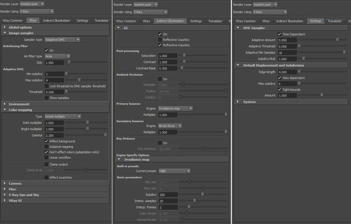
And here are the render settings that I used on my final scene:
Compositing (Photoshop)
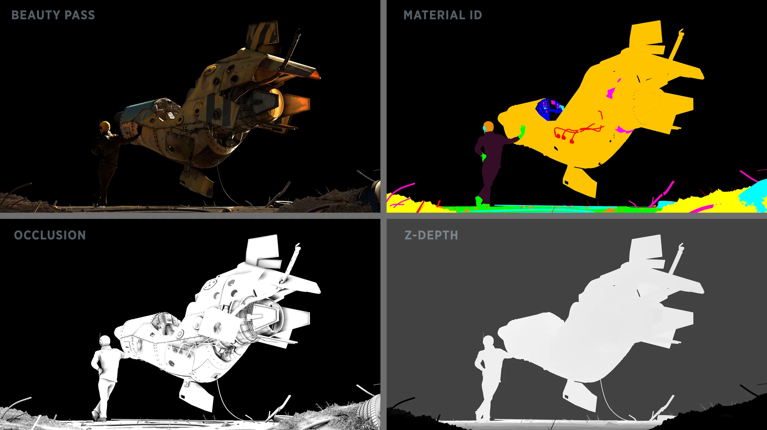
After rendering the scene, I also rendered out these passes to help in the compositing process:
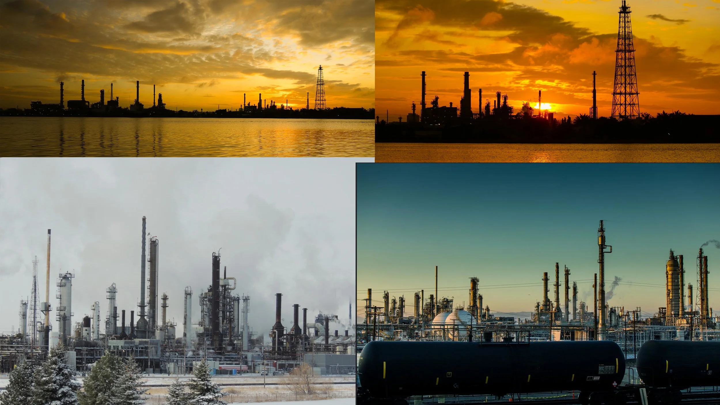
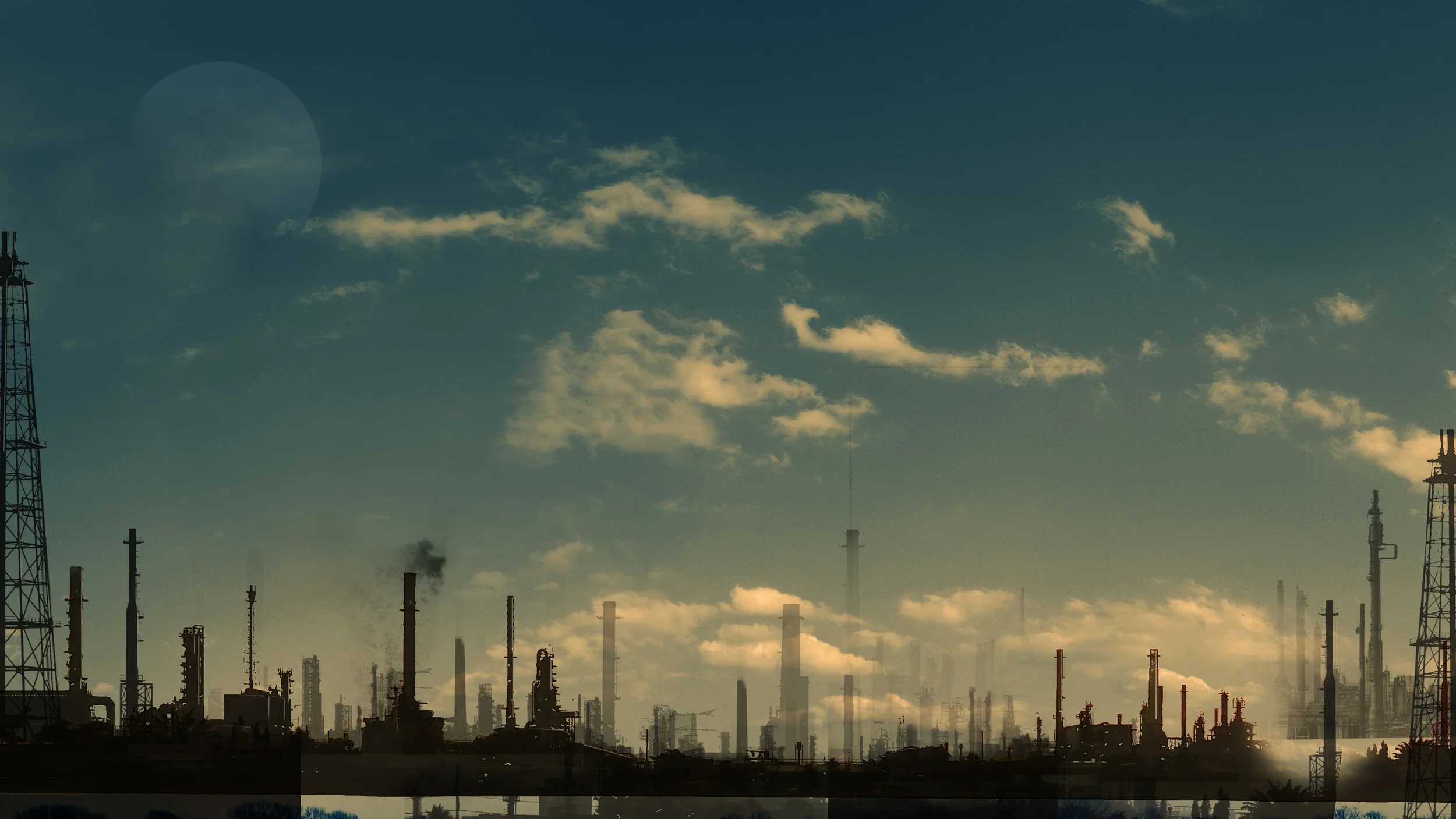
To create the background, I searched for some refinery landscapes on Flickr, and I got some interesting images.
Extracting and duplicating the shapes, I used the opacity to create depth and simulated atmospheric perspective.
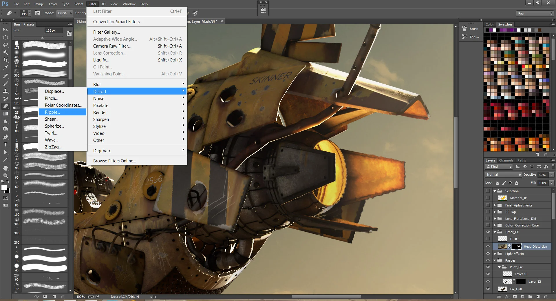
For the heat displacement effect I used the ripple effect with a mask.
I also used some lens flare and lens dirt effects for final adjustments, to give a “photographic” look to the image.
Final Thoughts
Finishing Wasp was an incredible personal achievement for me. I’d never done a whole 3D project like that before, and I learned a lot. It took me effort and endless hours to finally get something finished, but the final result was really rewarding.
And of course, I want to say thank you for all my friends who helped me during this project and also the amazing instructors at Think Tank Training Center, which is an amazing school and it has helped a lot my development as an artist.
If you've reached the end of this tutorial alive, I thank you for your time and patience. I hope I have helped in some way, and if you still have questions, feel free to contact me!
And if you liked it, please share with your friends and share the knowledge! :)
Thanks!
